Oct 0, 2026 · 5 min read

Japanese visitors used to tell me they loved my website, even though it was all in English. Something about the bold, slightly cartoonish style worked for them.
So when I decided to work with more Japanese companies, I kept the look and changed the message. The English hero says "I design for growth." The Japanese one talks to Japanese products heading to Western markets, because that's where I can help most.
英語だけのサイトなのに、日本の方からこのサイトが好きだと言ってもらえることがよくありました。大胆で、ちょっとマンガっぽいスタイルが、なぜか響いたようです。
そこで、日本の企業ともっと一緒に仕事をしたいと考えたとき、見た目はそのままに、伝えるメッセージだけを変えることにしました。英語版のヒーローは「I design for growth.」。日本語版では「日本のプロダクトを、欧米市場へ。」と、海外を目指す日本のプロダクトに語りかけています。私がいちばん力になれるのは、そこだからです

I translated the page with Claude, using a style guide I built from two of my newsletter issues that the Japanese design blog DMN had translated professionally (How culture shapes UX and Western vs Asian UX). Then my Japanese friends checked the live page.
Some titles stay in English on purpose, like UX/UI DESIGN and SHOPIFY REDESIGN. Many Japanese brands mix English into their copy to feel more international (which is exactly the feeling my clients want).
翻訳にはClaudeを使いました。ベースにしたのは、DMNで日本語に翻訳していただいた私のニュースレター2本(「文化がUXをどう形作るか」・「欧米とアジアのUX」)をもとに作ったスタイルガイドです。公開後は、日本人の友人たちに実際のページをチェックしてもらいました。
UX/UI DESIGNやSHOPIFY REDESIGNなど、いくつかのタイトルはあえて英語のままにしています。日本のブランドやデザイン会社は、英語を取り入れて国際的でモダンに見せることが多いですよね。私のクライアントが求めているのも、まさにその雰囲気なのです。

My English fonts, Unigeo and Cabin, don't support Japanese. Neither do any of my favourite fonts for neobrutalist web design. So I went font hunting, and it's harder than it sounds.
There are far fewer Japanese fonts to choose from. A Latin font needs a few hundred characters, but a Japanese one needs hiragana, katakana and thousands of kanji (there are 2,136 everyday kanji alone). Many fonts only cover part of that. The ones that cover everything often look almost the same, so there's little room for personality. And kanji have lots of small strokes, so keeping them readable is much harder.
For titles, simpler fonts like Noto Sans JP felt too plain. I wanted something bolder and cuter, so I picked Mochiy Pop One. It's round and bubbly, and it's based on the handwriting of Japanese women in their 20s. Noto Sans JP still won for body text. It's almost the default Japanese web font, so it's easy to read and very reliable.

英語版で使っているUnigeoとCabinは、日本語に対応していません。お気に入りのネオブルータリズム向けフォントも、どれも日本語には非対応。そこで日本語フォント探しを始めたのですが、これが思った以上に大変でした。
そもそも、日本語フォントは選択肢が少ないのです。欧文フォントなら数百文字で足りますが、日本語にはひらがな、カタカナ、そして数千の漢字が必要です(常用漢字だけでも2,136字)。一部の文字にしか対応していないフォントも多く、すべてそろったフォントはどれも似た印象になりがち。しかも画数の多い漢字は、読みやすさを保つのがさらに難しくなります。
見出しには、Noto Sans JPのようなシンプルなフォントでは物足りない。もっと大胆で、かわいさのあるものが欲しくて選んだのがMochiy Pop Oneです。丸みのあるポップな形は、20代の日本人女性が書いた文字をもとに作られています。一方、本文はNoto Sans JPに落ち着きました。日本語Webフォントの定番ともいえる存在で、読みやすく、安心して使えます。

The hardest part, for two reasons. I don't speak Japanese yet (I'm learning!), and web tools aren't really built for it. Japanese has no spaces between words, so a browser can break a line anywhere, even in the middle of a word. Google called this a long-standing problem in Japanese web typography back in 2016, and fixing it by hand needs Japanese vocabulary and grammar. There's a newer CSS fix, but Safari, the main browser on iPhones, doesn't support it yet.
On mobile, my hero ended with デザインメン on one line and ター。 alone on the next. That's like splitting "mentor" into "men" and "tor", and it's the first thing a Japanese reader notices. I fixed it with a custom no-break class in Webflow, added to words like デザインメンター, デジタルマーケティング and ニュースレター.
✨ Update: A few days after launch, a translator who's lived in Japan for over 20 years spotted breaks I'd missed in the body text, like 伝わ/る. Adding my no-break class to every paragraph wasn't realistic, so I asked Claude for help. It wrote a short script using Google's BudouX, an open-source tool that finds natural phrase breaks in Japanese. Now body text breaks in the right places automatically, even in Safari. I still use my custom class for a few titles where I want full control.
Want to fix this on your own site? Here's the prompt I'd use:
I have a Japanese website built in [Webflow / Framer / WordPress]. Browsers break Japanese text in the middle of words, for example デザインメン/ター. Please write a script I can paste into my site's custom code that uses Google's BudouX library to add natural phrase breaks to all Japanese text on the page automatically.
Requirements:
- Load BudouX from a CDN as a JavaScript module, so I don't need to install anything.
- Find every element that contains Japanese text and apply BudouX to it, without processing the same text twice.
- Leave English-only text alone.
- It must work in Safari, not just Chrome.
- Tell me exactly where to paste each part in [Webflow / Framer / WordPress].
いちばん苦労したのがここです。理由はふたつ。私の日本語がまだ勉強中であること、そしてWebのツールが日本語を前提に作られていないことです。日本語には単語の間にスペースがないため、ブラウザは単語の途中でも平気で改行してしまいます。Googleも2016年の時点で、これを日本語Webタイポグラフィの長年の課題と呼んでいました。手作業で直すには、日本語の語彙や文法の知識が欠かせません。新しいCSSの解決策もありますが、iPhoneの標準ブラウザであるSafariはまだ対応していないのです。
モバイルで見ると、ヒーローの最後が「デザインメン」で改行され、次の行に「ター。」だけがぽつんと残っていました。日本語を読む方なら、真っ先に目につくところですよね。
対策として、Webflowで改行させない独自のクラスを作りました。「デザインメンター」「デジタルマーケティング」「ニュースレター」などの単語に、ひとつずつ適用しています。
✨ アップデート: 公開から数日後、日本在住20年以上の翻訳者の方から、本文に残っていた「伝わ/る」のような改行を指摘していただきました。すべての段落に独自のクラスを付けるのは現実的ではないため、Claudeに相談。Googleのオープンソースツール「BudouX」を使った短いスクリプトを書いてもらいました。日本語の自然な文節を判断して、Safariでも本文を正しい位置で改行してくれます。改行位置を細かく決めたい一部の見出しには、今も独自のクラスを使っています。
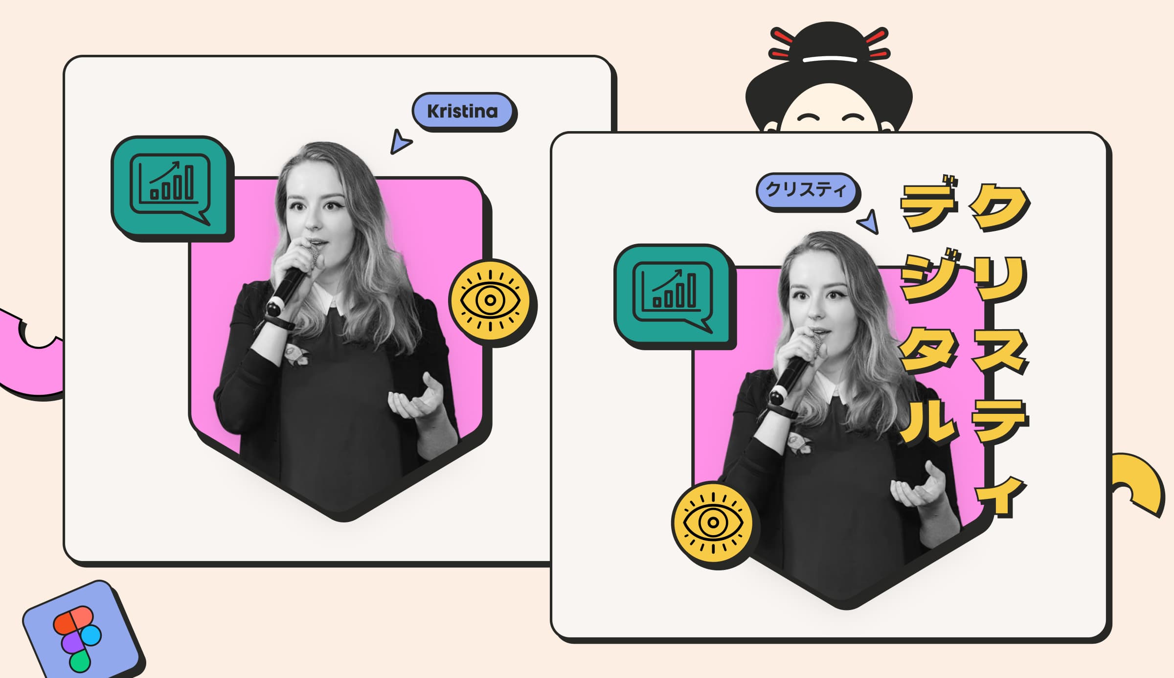
I only redrew the hero graphic, with my name in katakana (クリスティ) and a new label instead of "available for freelance". It's also a little busier than the English one, just for fun. I love that busier Japanese style.
描き直したのはヒーローのグラフィックだけ。名前をカタカナの「クリスティ」にして、「available for freelance」のラベルも差し替えました。英語版より少しにぎやかにしたのは、ただの遊び心です。情報がぎゅっと詰まった日本らしいデザインが大好きなので。

Japanese visitors liked my site in English. I'm curious what they'll say about it in Japanese.
If your brand wants to feel at home in the US or Europe, take a look at my Japanese page or tell me about your project 👋
英語だけでも気に入ってもらえたサイトです。日本語になった今、どんな感想をいただけるのか楽しみにしています。
欧米のお客様にも自然に届くブランドにしたい方は、日本語ページをご覧いただくか、お気軽にご相談ください 👋
I redesigned Victory Bladeworks’ Shopify store to lead with story, explain the value of their subscription model, and build trust with every scroll.

.webp)
.jpg)
In 2022, Sweatcoin became the world's most downloaded Health & Fitness App. One of the features that helped to gain more than 66M downloads that year was 'Scratch The Prize'.
Explore the innovative growth design strategies, in-app referrals, and the power of localization.
Designing for 120M+ users worldwide: dive into RTL localization challenges, from interface mirroring to cultural nuances, boosting user engagement.


This playful dog step calculator is designed for GenZ and their love for dogs. I was experimenting with neon and Midjourney AI to bring you a truly pawsome user experience.

Can we ever truly humanize crypto? Can we make crypto simple and user-friendly? The short answer: no.
A designer’s perspective on Web3, NFTs and the Crypto Space.