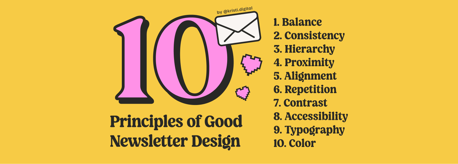
Distribute visual weight so no section overpowers the others. Symmetrical columns, asymmetrical heroes, and vertical flow that guides readers to your CTA.
Same heading styles, colors, font sizes, and spacing throughout. It builds trust and feels professional. Start with a mini style guide — even a simple Notion doc works.
Tell readers what to look at first, second, and next. Structure like a pyramid: big idea first (H1), clear sections (H2), detail below. People scan before they read — let them.
Group related content together. Don't separate your H2 from its paragraph, or your CTA from its context. White space isn't wasted — it gives readers room to breathe.
Mixing left and center alignment without purpose feels messy. Default to left-align — it's easier to scan, especially on mobile where most of your readers are.
Repeating elements create visual rhythm and a recognizable structure. Use it for buttons, quote blocks, callout sections, and lists — makes your newsletter feel intentional.
Contrast drives attention. Use it when you want to capture focus — like signalling which action is more important, or making a headline impossible to miss.
Good design works for everyone. Check color contrast ratios, use readable font sizes (16px minimum for body text), and never rely on color alone to communicate meaning.
Typography is the backbone of newsletter design. Limit yourself to 2 fonts max, establish a clear type scale, and respect line height — cramped text is unreadable text.
Pick a palette and stick to it. A primary color, a neutral, and one accent is enough — this is the 60-30-10 rule: 60% dominant, 30% secondary, 10% accent. More colors = more chaos. Let your content breathe, not compete with itself.
Want the full breakdown with examples and beehiiv-specific tips? Read full post →
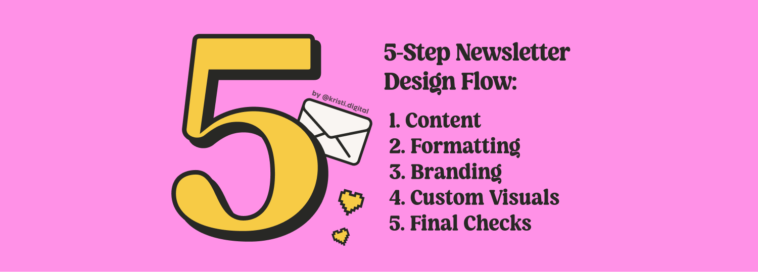
Write your content in the editor first. Don't touch styling yet — just focus on making your message clear and valuable on its own. Without solid content, no amount of design will help. This is your foundation.
Once your draft is written, add semantic formatting — not decoration. Headings for hierarchy, spacing to separate ideas, bold and italic for emphasis. Buttons, quotes, lists, and images to guide readers and improve scannability.
Now make it feel like you. Apply your colors, fonts, and visual style consistently. This is where your newsletter starts to look intentional and professional — not like a default template everyone else is using.
Custom banners, thumbnails, illustrations, or diagrams make your newsletter more memorable and shareable. Even simple Figma-made graphics go a long way. Skip stock photos — they feel generic and impersonal.
Preview on mobile. Check all links. Review subject line and preview text. Make sure your CTA is visible above the fold on mobile. Read it one more time with fresh eyes — ideally the next morning.
Want the full process with real examples, formatting cheat sheets, and visual walkthroughs? Read full post →

